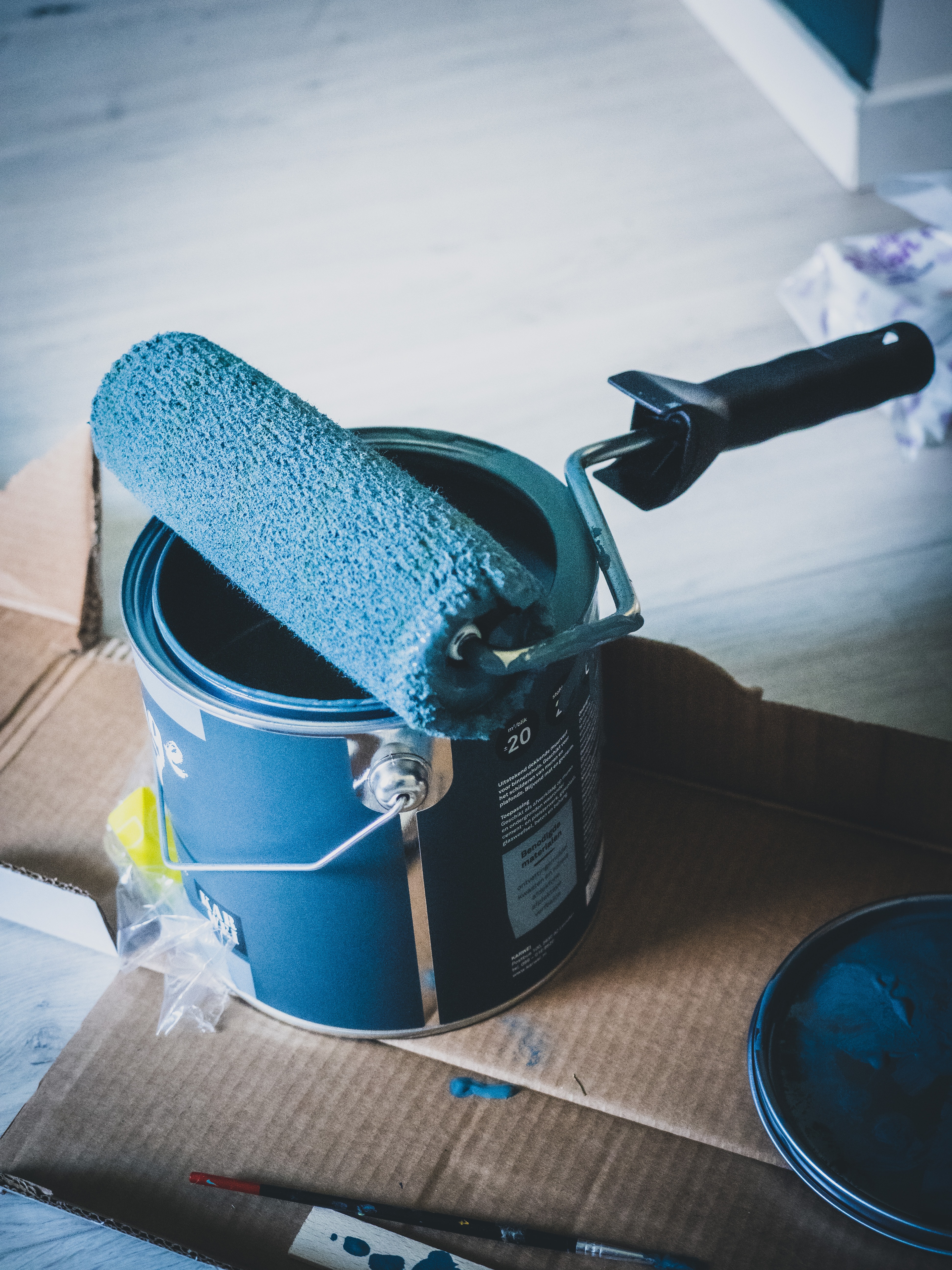
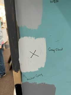
Color-Scheme Decorating Ideas. We are painting the store. It’s been 12 years, so it was surely about time (but, oh my goodness, what was I thinking painting a store whilst it’s open!). It’s 6400 square feet of sales floor, so that’s a big commitment when it comes to color. We wanted to get it right. We all voted on the color scheme and there was a lot of healthy debate, especially from Kathleen.
In the end, we chose Benjamin More’s Gray Timber Wolf for the walls and their Anchor Gray for the trim. For the register, we used the almost-black, Black Tar. We’re committed.; it’s our color-scheme and we are all pretty excited. It sets the tone for the newly-redesigned and freshly organized Consignments Ltd. It’s bringing the whole store together in a new way and enhancing the shopping experience for our customers. We are glad about it and we are hoping our customers will be too.
“Colors, like features, follow the changes of the emotions.”
Pablo Picasso


Color-Scheme Decorating Ideas. This project got me thinking about the blog that follows. I published a few years ago and have expanded and enhanced it here. It’s about this very issue: color-scheming. I thought we’d take a fresh look at it today. I hope you enjoy…
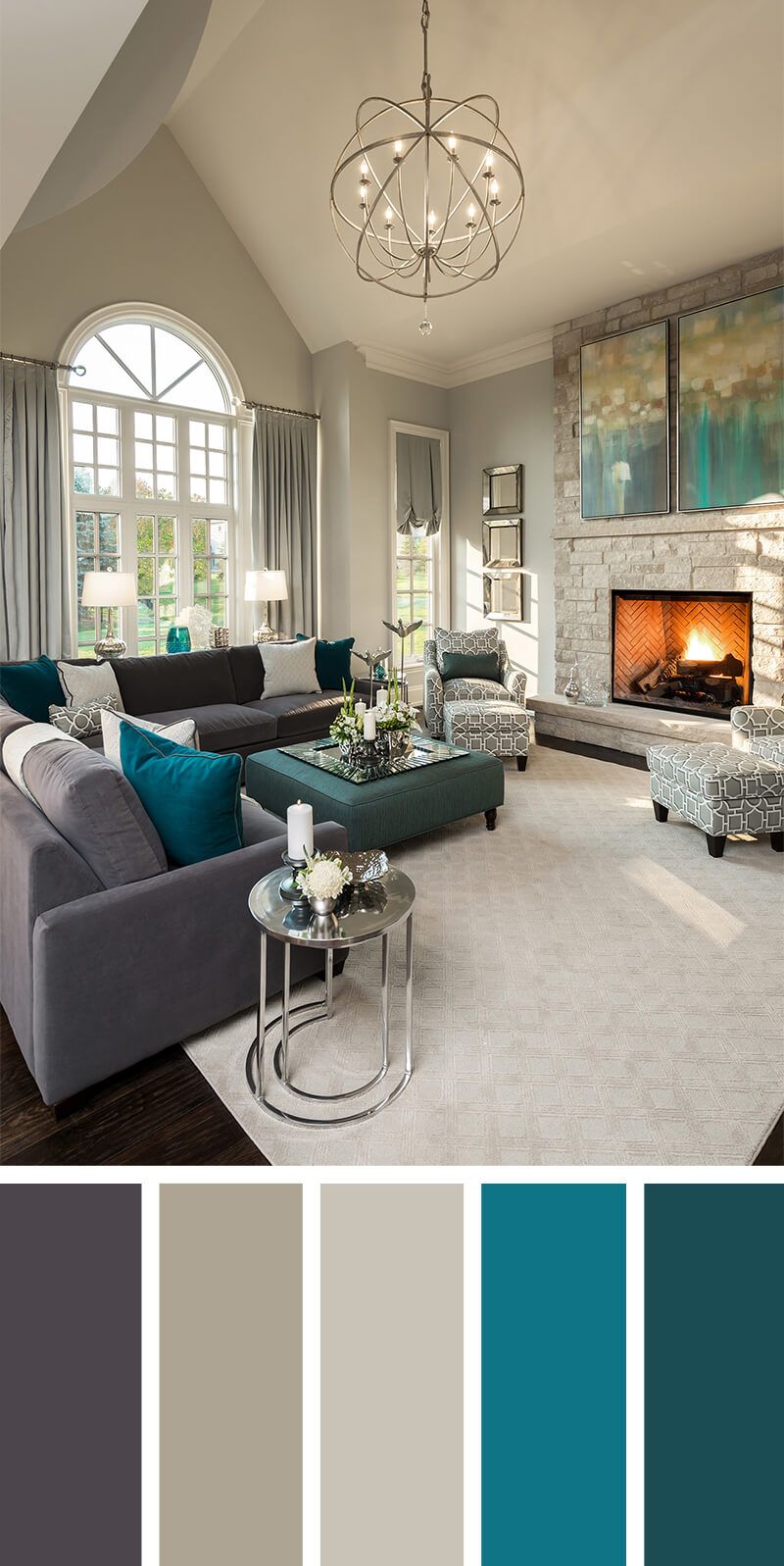
Color-Scheme Decorating Ideas: it can warm your heart, evoke a memory, set a mood or make a statement. Many times the colors that we chose to decorate with are chosen room-by-room, as we go. This can bring about some beautiful rooms, but often can result in some disjointed houses or businesses.
Choosing an overall color scheme for your home (or business), however, can make your space have an even better flow. It can also make it look more restful and give it a more well-thought-out appearance. There’s a reason all the flippers, like Christina Haack (aka El Mousa) of Flip or Flop and Christina on the Coast do it. Read on for some thoughts on picking a color you will love and then some further ideas for unifying your home’s color scheme.
Color-Scheme Decorating…Pick a Color You Like…
- If you are looking for color inspiration, there’s really no better place to start than your neighborhood paint store. The staff is usually highly trained and super-skilled at helping you . Plus paint stores like Benjamin Moore and Sherwin Williams have great online resources to help you choose. In store they also have paint cards and chips with color palettes already set up. Go in and see what you gravitate toward.
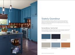
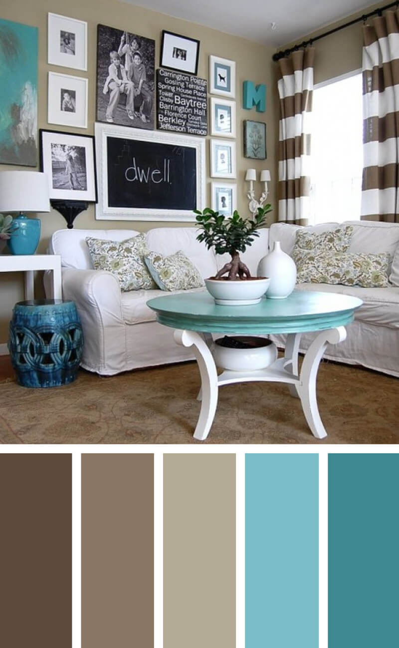
- Seek Inspiration From Something You Love…Use a furniture piece or a favorite textile. Be inspired by a piece of pottery you brought home from one of your trips abroad. For me, it’s the colors of the sea that inspire me – so turquoise, navy, sand, coral – it’s all over my home. You will pick it for a reason that evokes a positive feeling…, you already love it, so it’s a great place to start.
- So many colors,,, so little time… OK, so you picked a favorite color, maybe even a color palette to work with. but why stop there? Get going by:
- Picking two colors to be your primaries. These are the colors for your big furniture pieces or textiles (your couch, your bedspread, your kitchen cabinets).
- Then pick a lighter version of both of those colors for a coordinating color. This will be great to use as a wall color in some rooms or as a secondary accent. And remember, color doesn’t just mean solids – its colors within patterns – and that adds even more visual interest.
- Next, pick one or two accent colors (sometimes a good choice is the opposite or complimentary color – based on the color wheel- from your primaries). Accent colors add depth and personality to a room but more than anything they add visual interest. As long as you use the two primaries in each room in the home, at least once, your theme is beginning to take hold. Then, each space can have it’s own set of accent colors.
- Finally, pick one or two neutrals (that you will repeat) to balance your color palette. Great choices for these are gray, beige or white.
How to Make Your Color Palette Into A Unified Theme In Your Home:
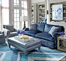
- Shampoo, Rinse, Repeat… it’s a trick retailers employ to get you to use more of their product, but in this case it’s my little mantra for unifying your home’s theme. If you repeat your color palette over and over in each room, suddenly you have a theme. Places to repeat your color theme include:
- Wall Color
- Tile (kitchen and Baths)
- Cabinetry (Kitchen and Baths)
- Textiles (Pillows, Curtains, Towels)
- Upholstery Fabrics (Chairs, Headboards, Couches)
- Accent pieces like candles, vases, art, table-scapes
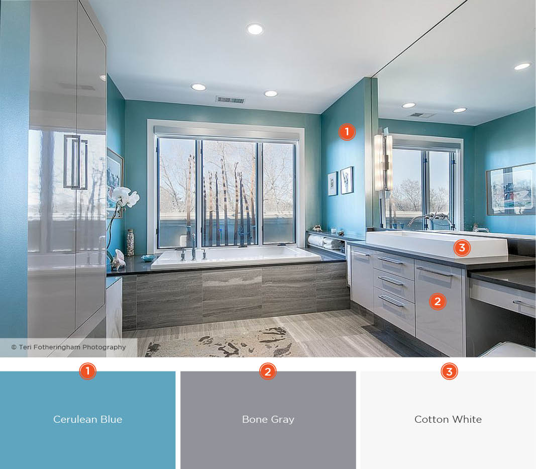
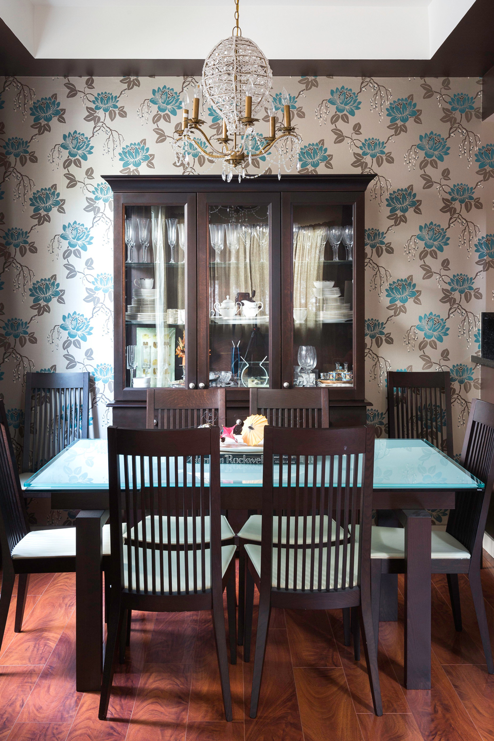
- Like a symphony – rooms next to each other must work together in harmony: The primary reason why homes do not look unified is because people put dissimilar colors in adjoining rooms. Each room may look great on its own, but side-by-side they are a disconnect. Consider using the two, lighter shades of your primaries or a shade of your neutral for wall color when rooms adjoin or are in view of each other.
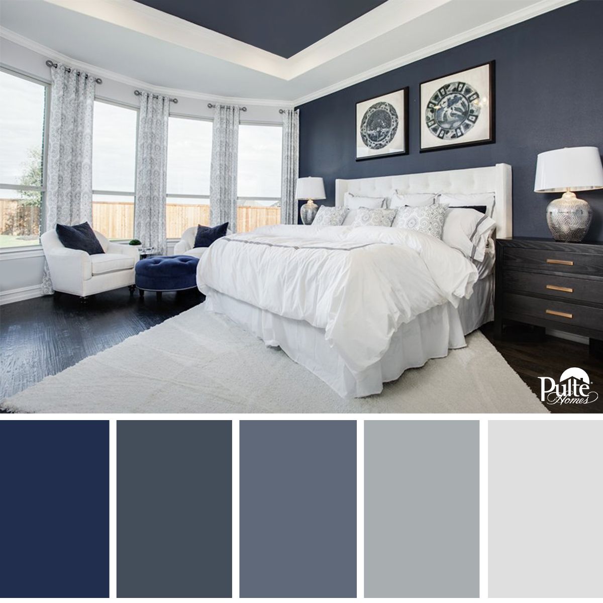
- Beyond Feng Shui … when you color scheme your home, you will reap some subtle, but very meaningful benefits. Your rooms work together so your home is more visually calming and this promotes rest and relaxation within your walls – literally! Your home will look like it was done by an interior designer – and only you will know the truth!
What Else Is Good About Decorating with A Color Theme?
When you use an overall color scheme in your home, your home accent purchases are more economical because accent pieces can move from room to room. The pillows from the couch in the den look equally good on the bed in the master bedroom. The turquoise vase can hold flowers in any room in the house, because the theme has been repeated and turquoise is an accent color used throughout. So have fun, establish a color theme, sit back and enjoy!
A Now For A Little Music Before We Go…
“The colors live a remarkable life of their own after they have been applied to the canvas.”
Edvard Munch



No Comments